Data-Driven Overview
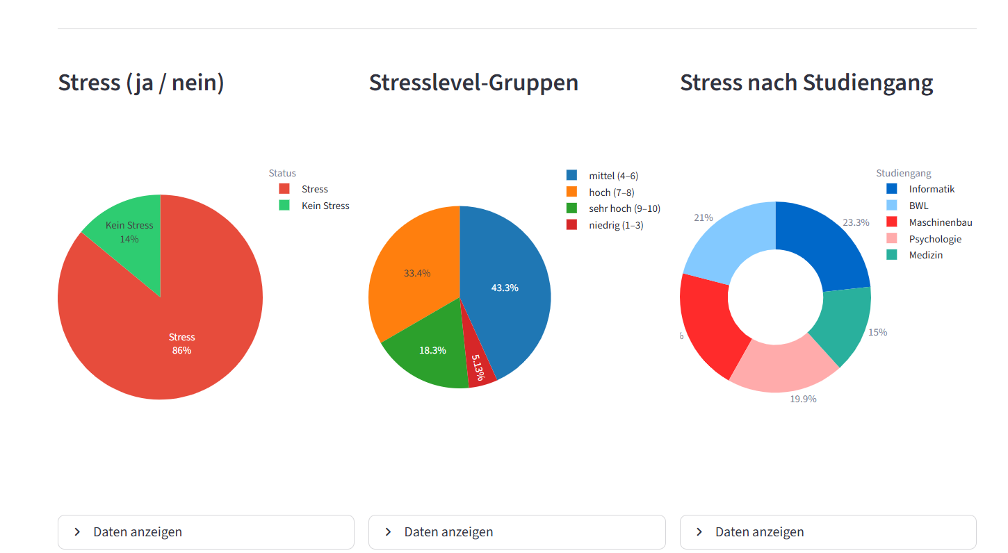
The dashboard provides a general overview of stress among students and makes broader patterns visible at a glance.
Data Visualization · Dashboard Design · Student Wellbeing
An interactive dashboard developed to explore how stress affects students, what causes it, and which strategies may help reduce it. Built as a university team project, the dashboard translates dataset findings into clear visual insights through charts, comparisons and accessible storytelling.
Overview
Stress is a central issue in student life, yet it is often discussed only in abstract terms. This project aimed to make the topic more visible by translating data into an interactive dashboard that communicates the scale, causes and consequences of student stress in a clear and engaging way. Instead of presenting isolated numbers, the dashboard was designed to help users understand relationships: what contributes to stress, how it impacts daily life and which actions may help reduce it. The result is a visual tool that combines information design with social relevance.
Core idea / dashboard purpose
Functions
The dashboard provides a general overview of stress among students and makes broader patterns visible at a glance.
Multiple diagrams were used to communicate the data in a clear and understandable way. These visualizations help compare causes, effects and behavioral patterns more effectively than plain text.
Rather than showing data without context, the dashboard guides users through the topic step by step — from prevalence to causes, consequences and possible coping methods.
Built as a digital dashboard prototype, the interface allows users to engage with information in a more dynamic and accessible format.
Use
Prototype / technical implementation
This project was developed as part of a university course in a team of three. The objective was to design and implement a functional dashboard that communicates the topic of student stress through data visualization. The team worked with a dataset from Kaggle and used Python for processing, structuring and displaying the data. The dashboard itself was built with Streamlit, enabling an interactive and web-based presentation of the analysis.
Team
I worked on the project as part of a three-person team and contributed to the conceptual development as well as the implementation of the dashboard. My work included helping shape the structure of the dashboard, supporting the coding process in Python and contributing to the translation of the dataset into visual and understandable insights.
INTENT
The project explores how dashboards can do more than display numbers. Its aim was to communicate a socially relevant topic in a way that is informative, approachable and visually understandable. By focusing on stress among students, the dashboard combines data analysis with human-centered communication and shows how visualization can support awareness, reflection and education.
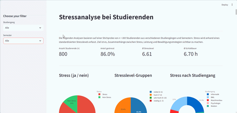
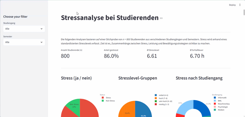
Preview
The following interface previews show selected sections of the dashboard and illustrate how the visualizations communicate key insights about student stress.
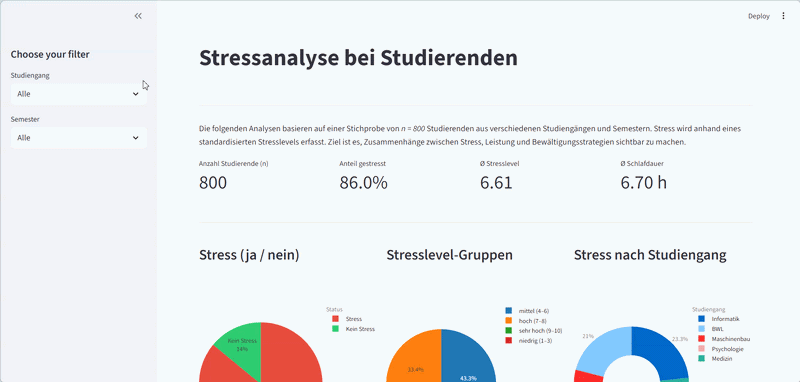
Overview of student stress patterns and key metrics.
Visualization of major stress factors affecting students.
Insights into consequences of stress and possible coping strategies.